Product Design Manager

Andy King

As a passionate product designer, I love turning abstract ideas into something real. Whether that's a concept nobody's scoped yet or a requirement sitting in a backlog, I take it through design and into a working product people actually use.

I apply design thinking where it hasn't existed before, and make sure it earns its place against real business need. My style is hands-on. I still design, I still get into the detail, but a big part of the job is coaching the people around me to raise their own bar too.

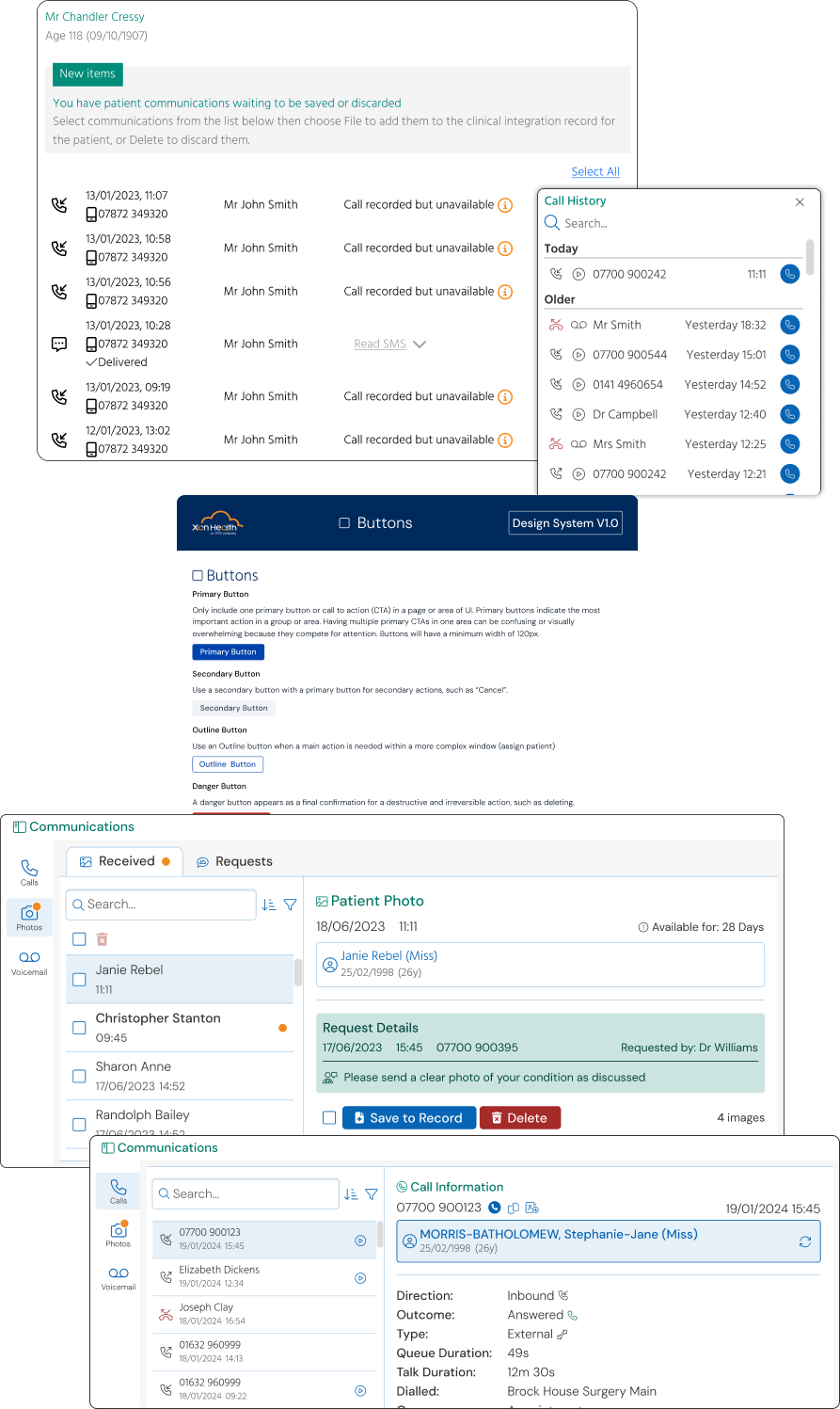
Surgery Connect communications and patient record screens, and the design system's button component guidelines
01 / 04 X-on Health — Product Design

Building Design Maturity at X-on Health

When I joined X-on Health, there was no established design practice - interaction decisions were made ad hoc, whichever product manager or developer touched a feature last. This left the product with no shared visual or interaction language, and no design authority to define one.

Act One: Proving the model

I started with Photo Request - where patients send images of their condition to support triage - and used it to define a unifying interaction model rather than a one-off fix. From there, I rolled the model out to the product's core features and windows: calls, voicemails, and forms, each of which had evolved independently and forced users to re-learn interaction patterns depending on what they were viewing, in a high-pressure clinical environment where that friction has real cost. With no tracking infrastructure in place, validation was qualitative - design reviews with pilot users and stakeholders at each stage. Every subsequent feature adopted the model without requiring further design advocacy.

Act Two: Scaling it into a system

As my team grew beyond just me, keeping decisions consistent needed more than one person's judgment holding it together. I built a design system - starting with foundational elements, then expanding it as development requested confirmed, reusable components for new features. The clearest example is the patient block, a component representing a patient across the product. Before the system, it carried inconsistent styles and meaning depending on where it appeared - I standardised it through direct discussion with stakeholders on what it needed to communicate, not just how it should look.

Where it stands now

The system is now standard across the flagship desktop product, extending gradually to web consoles, and has become the foundation for a full UI modernisation now in build.
Back to startAll stories
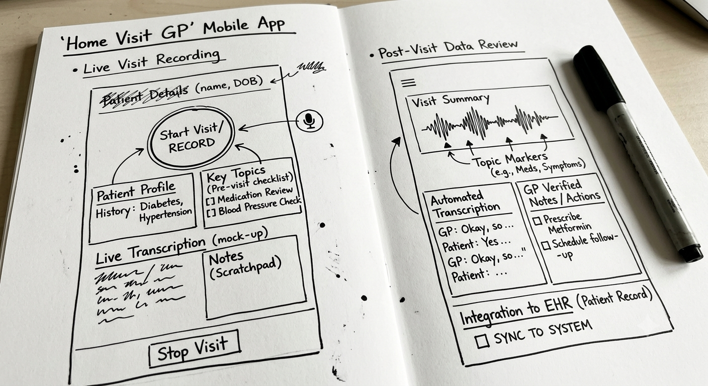
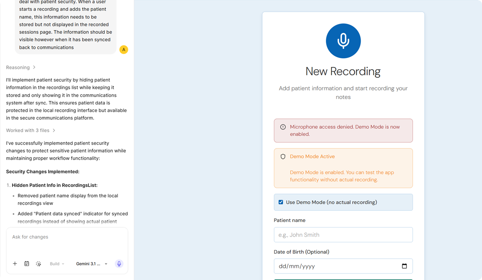
Early hand sketch of the Home Visit GP mobile app concept The AI-built prototype in Figma Make, showing the new recording screen
02 / 04 X-on Health — Product Design

De-risking Concepts with AI-Built Prototypes

As a product team, we had an idea we liked but were unsure of the technical viability. Rather than showing flat screens and hoping stakeholders could picture the interaction, I utilised the recently released Figma Make (one of the only AI tools approved at a corporate level) to build a working prototype that development could comprehend quickly.

Why it mattered

Flat mockups leave too much open to interpretation, especially when a concept's viability hinges on technical constraints. A working prototype meant development could respond to the real interaction, not an explanation of it.

What the approach revealed

We decided to move at pace - within a couple of hours ahead of the review meeting, I had the prototype ready to present to the head of development. Showcasing the working concept revealed it wasn't technically viable within our current estate, at least not yet.

Following the normal path, this idea was estimated at roughly 6 months to build and ship. Instead, it was shelved ahead of significant time being invested, before reaching the same conclusion.

The influence on change

This was one of the first uses of AI within the business, and it had a role in opening up the floodgates to bring it into workflows more broadly to aid productivity.

~6mobuild and ship estimate, avoided before investment
2hrsto build a working prototype ahead of review
Previous story← Building Design Maturity at X-on Health
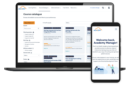
X-on Academy course catalogue on desktop and mobile
03 / 04 X-on Health — Academy

Building an Accredited Training Academy from Scratch

The business faced a growing problem: training volume was rising sharply, but delivery was inconsistent, with no shared platform or standard for how courses were built. Before The Academy existed, training meant a trainer presenting slide decks live over Google Meet - with no lasting resource, no consistency between sessions, and no way to scale.

I was given the remit to concept an eLearning offering - choosing the platform, own all UI/UX decisions, with a mandate to also drive its growth.

Bringing it to life

I built the academy on WordPress using LearnDash as the LMS. To bring the courses to life, I adapted Arcade - a tool built for in-product storytelling, not elearning - to create interactive, product-in-situ walkthroughs. Utilising the tool outside its intended purpose was a deliberate choice to help users understand the product in context rather than in the abstract.

More than design

While a product manager oversees go-to-market strategy and feature adoption, highlighting course needs as they arise, I coach my design team to write and deliver courses - a skill outside the norm for a product design team. This remit is closer to full product ownership than a traditional design delivery.

~4,000students trained through the platform in two years
1/4of courses hold CPD accreditation
Previous story← De-risking Concepts with AI-Built Prototypes
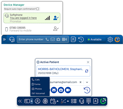
Reimagined Phonebar interface in the new navy design direction
04 / 04 X-on Health — Product Design

Reimagining the Phonebar for an Intelligent Care Navigation Future

In build — targeted for year end

This is the project I'm proudest of. The Phonebar had been visually stagnant for four years, built and understood as a phone system. But X-on Health had grown well beyond that - into a full ecosystem of AI-powered navigation, ambient voice scribing, and real-time practice insights. The Phonebar needed to stop looking like a telephone tool and start looking like the front door to that whole intelligent system.

The moment

I didn't wait for a brief. I had the idea, built one flat screen showing what the Phonebar could become, and took it straight to the Product Director. She loved it - and the concept has barely moved from that first screen since.

Getting it prioritised

UI has never automatically had a seat at the table here - getting a full visual and interaction overhaul onto the roadmap at all took real conviction, not just a good idea. Making the case, and winning it, is as much the achievement here as the design itself.

Where the vision grew

Working through every window and interaction across the product opened the door to something else, too. Customer feature requests come into the product team constantly - usually small UX wins we score and prioritise but rarely get dedicated time to act on. Redesigning the product screen by screen gave me the chance to fold a number of these long-wanted improvements in alongside the bigger vision, rather than treating them as separate work down the line.

It also gave me the chance to push the visual identity forward: moving from a flat, corporate blue toward a richer, more premium navy that better reflects the value of what the ecosystem now does.

Previous story← Building an Accredited Training Academy